
Color Blocking in Everyday Outfits: A Practical Approach to Bold Combinations

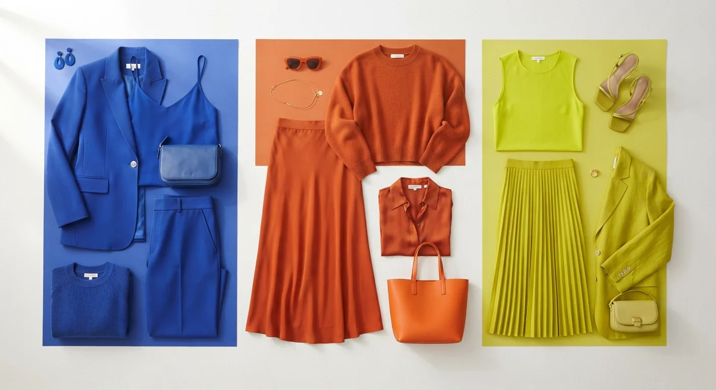
Photo: InfoAlly.net | Finding Info Made Easy editorial
Key Takeaways
- Color blocking pairs two or more solid, contrasting hues in distinct sections of an outfit.
- A color wheel helps identify complementary and analogous pairings that feel intentional.
- Proportion and tone control how bold or wearable a color-blocked look becomes.
- Neutral anchors let you introduce one bold color without overwhelming an outfit.
- You don't need a new wardrobe - color blocking works with pieces you already own.
Why Color Blocking Works - and Why It Feels Hard
Color blocking has cycled through fashion decades - from the graphic designs of the 1960s to the structured separates of the 1980s and today's maximalist revival - because it delivers visual impact without requiring pattern or texture. When it's done well, it looks deliberate and energetic. When it goes wrong, it just looks like you grabbed whatever was clean.
The gap between those two outcomes is usually not instinct - it's principle. Understanding a handful of foundational concepts (contrast, temperature, proportion, and tone) closes that gap fast. You don't need fashion training to use them; you just need to slow down and apply them before you leave the house.
What you will need
For context on how this approach differs from single-tone dressing, monochromatic vs. mixed palettes breaks down when each method is most effective.
Start With What You Already Own
What You'll Need Before You Start
Color Wheel (physical or app-based)
Helps identify complementary, analogous, and triadic color pairings for intentional combinations.
Full-length mirror
Lets you assess proportion and how color blocks land across your full silhouette.
Neutral base pieces
White, black, beige, or grey items that anchor bolder colors and prevent visual overload.
Let Accessories Do the Heavy Lifting
How to Build a Color-Blocked Outfit Step by Step
Understand the Core Logic of Color Blocking
Color blocking means pairing two or more solid, high-contrast colors in clearly defined sections - think a cobalt blue top with terracotta trousers, or a lime green skirt with a violet blazer. The key word is defined: each color occupies its own visual zone rather than blending or transitioning.
Grab a color wheel and locate your starting color. Colors directly opposite each other (complementary pairs, like blue and orange) create the most drama. Colors sitting two to three steps apart (analogous pairs, like teal and green) feel more harmonious and are easier to wear daily.
Choose Your Dominant and Accent Colors
Successful color blocking isn't 50/50. Assign one color roughly 60-70% of the outfit's visual real estate, a second color 20-30%, and - if you're adding a third - the remaining slice. This proportion prevents visual chaos and gives the eye a clear focal point.
If you're working with a particularly bold hue (think electric yellow or fire-engine red), let it be the accent rather than the dominant color, especially when you're still building confidence. For a deeper dive into how your personal coloring influences these choices, see how shades interact with your skin tone and undertones.
Match Color Temperature Across the Outfit
Colors carry a temperature - warm (reds, oranges, yellows) or cool (blues, greens, purples). Mixing a warm dominant with a cool accent is a classic color-blocking move, but clashing temperatures within the same color family (a warm red with a cool pink, for example) can read as unintentional rather than bold.
Check each color's undertone before committing. Holding pieces up to natural light side-by-side is the most reliable way to spot temperature mismatches before you head out the door. Color temperature also becomes especially important during seasonal wardrobe transitions - transitional dressing principles can help you think about how color warmth shifts with the season.
Use a Neutral to Anchor Bold Pairings
When two bold colors feel like they're competing, introduce a neutral - white, ivory, black, grey, or camel - between or alongside them. A white belt, black boots, or a beige bag acts as a visual pause that keeps the outfit from tipping into sensory overload.
Neutrals don't dilute a color-blocked look; they frame it. Think of them the way a gallery uses white walls to let artwork breathe.
Check Proportion Against Your Silhouette
Stand in front of a full-length mirror and assess where each color block falls on your body. A very dark color on the lower half visually grounds the look; a bright color draws attention to that zone. Neither is inherently right or wrong - it's about deliberate choice, not camouflage.
Consider how the color-blocked outfit reads alongside occasion context. A bold combination that works beautifully on a weekend can feel misaligned at a formal setting - bridging everyday and occasion dressing covers how to calibrate this.
Edit and Wear With Intention
Remove one piece and see if the look still works. Over-accessorizing a color-blocked outfit dilutes the impact - the blocks themselves are the statement. Keep jewelry minimal and let the palette do the talking.
If you're curious how color blocking compares to the pull of a single standout piece, the case for and against statement dressing offers a useful counterpoint.
Avoid Competing Prints and Textures
The content on this site is for informational purposes only and is not a substitute for professional advice. Always consult a qualified professional for guidance specific to your situation.