
Monochromatic Outfits vs. Mixed Palettes: Reading the Room on Color

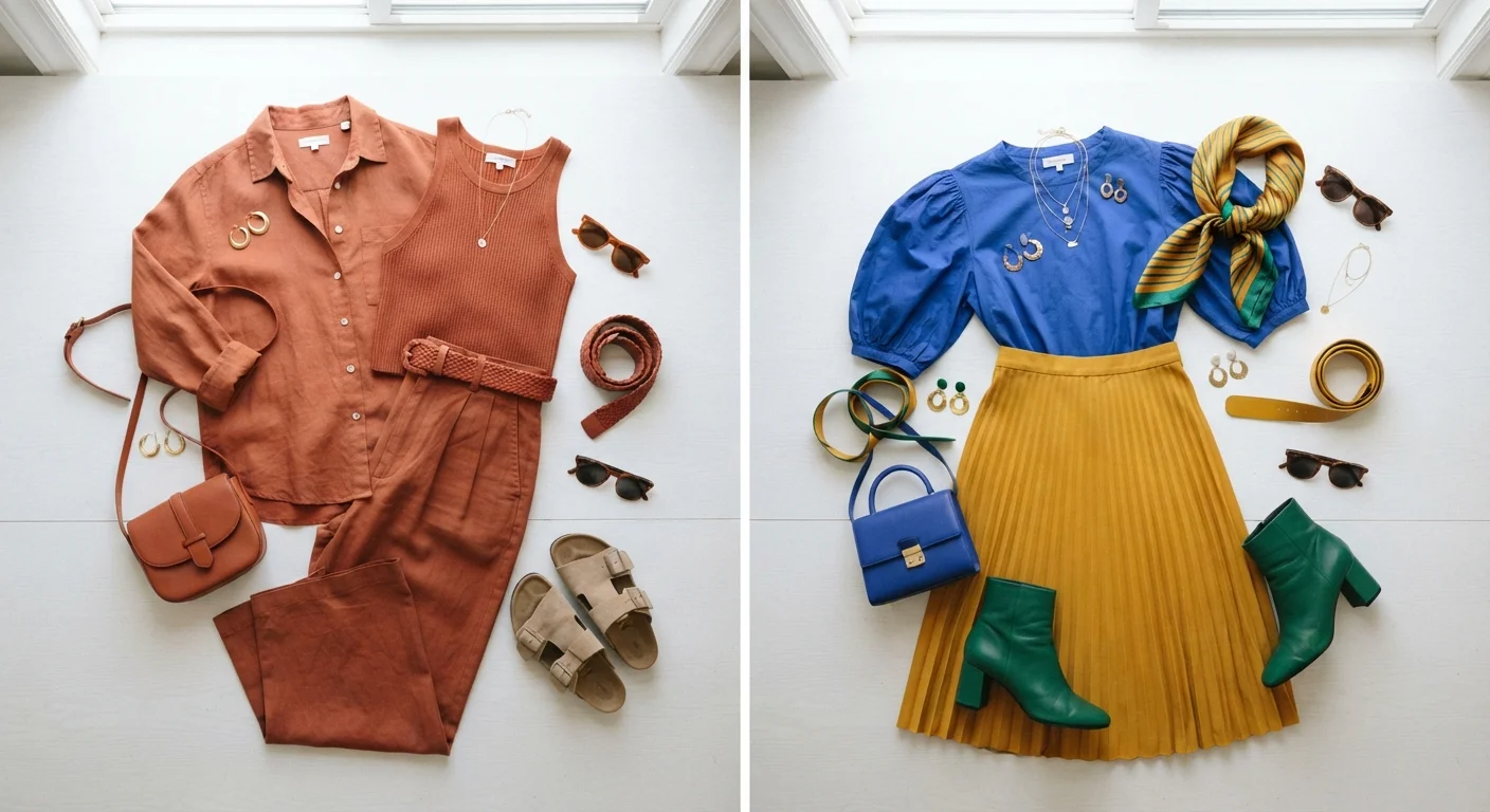
Photo: InfoAlly.net | Finding Info Made Easy editorial
Key Takeaways
- Monochromatic outfits create a streamlined, elongating silhouette that works especially well in professional settings.
- Mixed palettes inject personality and visual energy, making them ideal for creative environments and social occasions.
- Tonal variation within a single hue - using light, mid, and dark shades - keeps monochromatic looks from feeling flat.
- The 60-30-10 color principle can help structure mixed-palette outfits so they feel intentional rather than chaotic.
- Both approaches work for every body type; the key is understanding how color placement guides the eye.
- Context - workplace, event, season - should influence which strategy you reach for on any given day.
What Each Approach Actually Means
Before you can choose between them, it helps to define the terms clearly. A monochromatic outfit uses a single base hue across all pieces - but that doesn't mean wearing the exact same shade head to toe. The most polished versions layer tonal variations: a pale sage blouse with mid-tone olive trousers and deep forest green shoes, for example. The eye reads the look as cohesive while subtle contrast keeps it interesting.
A mixed-palette outfit intentionally combines two or more distinct hues. That range is wide - it includes soft analogous pairings (colors adjacent on the color wheel, like blush and peach) all the way to high-contrast complementary combinations (think rust and teal). For a deeper dive into bold combinations, see color blocking in everyday outfits. Understanding where your mixed outfit falls on that spectrum helps you predict how it will read in different environments.
How Each Strategy Reads in Different Settings
Color communicates before you say a word, which is why matching your palette strategy to your environment matters.
| Monochromatic | Mixed Palette | |
|---|---|---|
| Visual effect | Streamlined, elongating | Dynamic, energetic |
| Best setting | Professional, formal | Creative, social, casual |
| Ease of getting dressed | High - pieces coordinate easily | Moderate - requires intentional pairing |
| Proportion control | Draws eye vertically | Creates horizontal focal points |
| Trend flexibility | Timeless and season-agnostic | Highly adaptable to seasonal trends |
| Risk of misstep | Can look flat without texture | Can look chaotic without structure |
Monochromatic in professional settings reads as authoritative and pulled-together. The unbroken color line also creates a visually elongating effect, which many people find flattering. In creative industries, a tonal all-black or camel look still signals intentionality while leaving room for expressive accessories.
Mixed palettes in social or creative contexts signal openness, energy, and personality. A well-executed palette mix at a weekend brunch or gallery opening can feel more approachable and memorable than a neutral uniform. The risk is that poorly balanced mixes can read as accidental rather than artful - which is where structure helps.
If you're unsure what your current wardrobe skews toward, a style audit can reveal your instinctive color patterns and flag any gaps.
Working With Body Proportions and Visual Flow
Both strategies interact with how the eye travels across an outfit - and that has real implications for proportion and silhouette.
With monochromatic dressing, the absence of color breaks means the viewer's eye moves vertically, which typically creates the impression of height and length. This is why a single-color suit or a tonal knit set tends to feel so effortlessly streamlined. The effect is amplified when you match shoes to the outfit's dominant hue.
Mixed palettes, by contrast, create horizontal stopping points wherever a new color begins. A brightly colored top paired with a neutral bottom naturally draws attention upward - a technique many stylists use intentionally. Conversely, a bold waistband or color-blocked skirt shifts focus to the midsection. Neither outcome is inherently good or bad; it's about whether it aligns with what you want to highlight.
Try a Texture Swap Before Adding Color
Understanding your personal relationship with color - beyond just what's flattering - is worth exploring. Colour confidence principles can help you figure out which hues energize your complexion and which ones fall flat, regardless of the palette strategy you choose.
Making Each Approach Work Practically
The best color strategy is one you can actually execute on a busy morning. Here's how to make both approaches reliable rather than effortful.
For monochromatic dressing: Invest in a few key pieces in two or three tonal families - warm neutrals, cool blues, or rich earth tones, for instance. Varying texture (linen versus knit versus structured cotton) within a single color prevents the look from reading as a uniform.
3-5
Tonal families for a versatile monochromatic wardrobe
Style educators generally suggest anchoring a tonal wardrobe around a small number of hue families to maximize mix-and-match potential.
60-30-10
Color proportion rule for mixed-palette outfits
The 60-30-10 principle is a widely referenced guideline in interior design and fashion styling for creating balanced multi-color combinations.
For mixed palettes: The classic 60-30-10 rule is a useful starting framework - roughly 60% of the outfit in a dominant color, 30% in a secondary hue, and 10% in an accent. This structure prevents any one color from competing too aggressively with the others. If you enjoy leaning into seasonal trends, a mixed approach pairs naturally with a trend-driven closet philosophy where you rotate accent pieces each season.
Both strategies also translate well across weather transitions. Transitional dressing techniques - like layering warm and cool tones - can extend either approach through unpredictable seasonal shifts.
The content on this site is for informational purposes only and is not a substitute for professional advice. Always consult a qualified professional for guidance specific to your situation.