
Colour Confidence: Understanding What Shades Work in Your Wardrobe

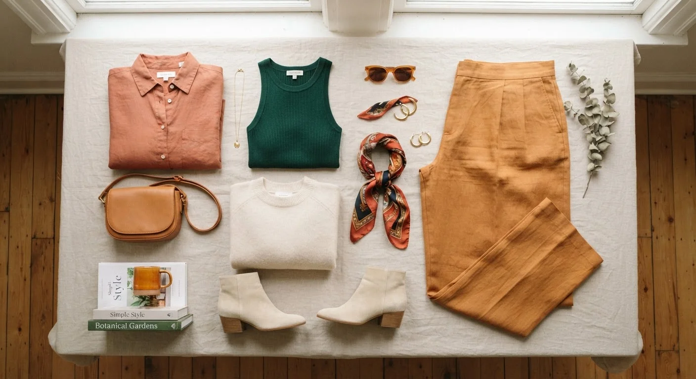
Photo: InfoAlly.net | Finding Info Made Easy editorial
Key Takeaways
- Undertone - not skin colour - is the most reliable guide to flattering shade choices.
- Contrast level between your features and clothing dramatically affects how an outfit reads.
- A personal colour palette works best when built around shades you actually enjoy wearing.
- Colour principles are flexible tools, not rigid rules - personal preference always has a place.
- Seasonal colour shifts can refresh a wardrobe without replacing your whole closet.
Why Colour Matters in Getting Dressed
Colour is one of the first things people register about an outfit - often before silhouette, fabric, or fit. The shades you wear communicate mood, influence how rested or energised you appear, and affect how cohesive a look feels from across a room. Yet many people pick colours by habit or default rather than intention.
This guide isn't about rigid rules telling you what you're «allowed» to wear. It's about giving you a practical framework so that colour becomes a tool you reach for confidently rather than a source of morning-wardrobe anxiety. See how colour principles connect with proportion and fit in our guide to dressing for your body shape.
Skin undertone
The subtle underlying hue of your skin - cool (pink/blue-based), warm (yellow/golden-based), or neutral - that stays consistent regardless of surface tan or seasonal change.
Colour contrast
The degree of visual difference between the colours of your hair, eyes, and skin relative to the clothing shades you wear. Higher contrast creates bolder, more dramatic looks.
Personal colour palette
A curated set of shades - neutrals and accents - chosen to work together in your wardrobe based on your undertone, contrast, and personal preferences.
Colour temperature
Whether a shade reads as warm (orange-leaning) or cool (blue-leaning). Even 'neutral' colours like grey or white have a temperature that affects how they sit alongside your skin tone.
Saturation
How vivid or muted a colour appears. A highly saturated red is bold and bright; a desaturated red reads as dusty rose or brick. Saturation affects the mood and formality of an outfit.
Seasonal colour analysis
A system that groups people into four seasonal types (Spring, Summer, Autumn, Winter) based on undertone and contrast level to suggest harmonious colour families.
Skin Tone and Undertone: The Real Starting Point
There's an important distinction between skin tone (your surface depth - fair, medium, deep) and undertone (the subtle hue underneath - cool, warm, or neutral). Undertone is where most flattering-colour advice actually lives, because it remains relatively constant regardless of tanning or seasonal shifts.
- Cool undertones tend to harmonise with blues, blue-based reds, purples, and true whites.
- Warm undertones often feel at home in earthy oranges, golden yellows, olive greens, and creamy off-whites.
- Neutral undertones can pull from both sides of the spectrum with ease.
These are tendencies, not absolute verdicts. A person with warm undertones may find that a deep cobalt blue, worn as a tailored blazer, still reads beautifully against their complexion. Observe - don't just accept theory at face value.
The Selfie Test Works
Contrast: The Overlooked Key to a Polished Look
Contrast describes the degree of difference between your natural colouring - hair, eyes, skin - and the colours you wear. High-contrast individuals (think very dark hair against light skin, or vice versa) often look striking in bold colour combinations or sharp light-dark pairings. Lower-contrast individuals may find that softer, more tonal looks feel more harmonious on them.
This principle explains why the same emerald-green dress can look dramatically different on two people of identical undertone but different contrast levels. Understanding your own contrast range helps you decide how much colour drama to introduce rather than guessing each time.
For a deep dive into how mono-tonal and multi-colour pairings read in real settings, explore monochromatic outfits vs. mixed palettes.
Don't Let One Framework Box You In
Building Your Personal Colour Palette
A personal colour palette is simply a set of shades that work together in your wardrobe and consistently make you feel good. Building one doesn't require a professional consultation - though seasonal colour analysis can be a worthwhile starting point for some people.
- Audit what you already reach for. Pull out the pieces you wear most often. Patterns emerge quickly.
- Identify your neutrals. These are your high-use base shades - navy, camel, grey, ivory, black, or warm brown. Choose two to four that genuinely versatile for your lifestyle.
- Select accent colours. Pick three to five shades that energise you and complement your neutrals. These might be seasonal favourites or consistent throughout the year.
- Test proximity to your face. Hold fabric near your face in natural light. Notice whether your skin looks clearer and your eyes brighter, or whether the shade draws attention away from you.
Once your palette is sketched out, it becomes much easier to build a wardrobe that actually gets worn rather than one full of impulse purchases that never quite fit together.
Colour Across Seasons and Occasions
Your colour palette doesn't need a complete overhaul each season. Instead, think of seasonal dressing as shifting the temperature of your existing palette. Richer, deeper shades - burgundy, forest green, rust - naturally feel appropriate as light fades and temperatures drop. Lighter, more saturated versions of similar hues read as fresh in spring and summer.
Occasion matters too. Workplace environments, social gatherings, and casual weekends each carry their own unspoken colour norms. Muted, low-saturation tones tend to read as professional; high-saturation brights often feel celebratory or casual. Neither is better - the key is matching intention to context.
Colour temperature - whether a shade reads as warm or cool - also plays into how outfits layer across seasons. Transitional dressing covers how to use colour temperature alongside fabric weight to stay comfortable and put-together when the weather is unpredictable.
This article is for general style and informational purposes only. Colour guidance is subjective and based on widely used principles - individual results will vary based on personal preference and context.
Frequently Asked Questions
The content on this site is for informational purposes only and is not a substitute for professional advice. Always consult a qualified professional for guidance specific to your situation.